Hakuto sites no longer look like AI sites
You know the look. Centered hero, purple gradient, three feature cards, the same font everywhere. You can spot an AI-built site in about a second, and so can your visitors.
Hakuto had that problem too. The sites worked and the SEO was good, but put three of them side by side and they looked like siblings. That bugged me, so we reworked how the Website Builder skill handles design.
Claude now designs before it codes
The skill now goes through roughly what a designer would before anyone writes code:
- It reads the brief and asks only about real gaps. If you’ve already said who the site is for and what vibe you want, it doesn’t ask again.
- It proposes 2–3 different directions. Each one differs in at least two big ways, like light vs. dark, warm vs. cool colors, or how bold the layout is. You pick one, or mix two.
- It sets three design dials. Layout variance, motion and density, each from 1 to 10, based on what you told it. A high variance score rules out the centered-hero default and pushes it toward asymmetric and bento layouts.
- It shows you a style preview first. One page with the palette, the type and a sample hero. You give feedback there, where changes are cheap, before it builds the rest of the site.
- Design styles are starting points. The palette and fonts are generated fresh for each project, so two sites in the same style still end up looking different.
Two recent examples
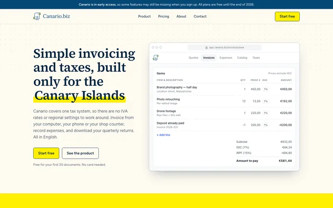
Canario is invoicing and taxes built only for the Canary Islands. It got a warm off-white background, a serif headline, a bright canary-yellow highlight and an actual invoice screen from the app in the hero:
IntraMuros is a private AI assistant that runs on a machine in your office. Its audience is clinical research and medical device firms, so it went quiet and editorial: a large serif headline with an italic accent, muted purple and bronze, and a faint isometric drawing of the machine:
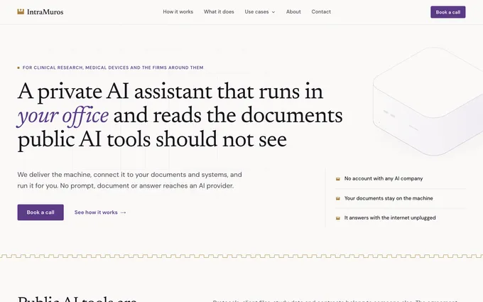
Same skill, same workflow, and you’d never guess the two sites came from the same place.
We redesigned hakuto.dev too
If you’ve been here before, you’ll notice. The old static hero image is now a live diagram of how Hakuto works, with Claude pushing to GitHub and GitHub deploying to Cloudflare. The layout uses bento grids and a scroll-drawn timeline, and the dark, IDE-like look with an amber accent fits a tool for people who live in a terminal.
The whole redesign kept the same copy, colors and fonts. Only the layout and motion changed. I asked for “more modern and dynamic”, and the skill turned that into higher variance and motion settings.
Try it on your next site
If you already have the plugin, update it and you’ll get the new design process the next time you build a site. Already have a Hakuto site that looks a bit too AI? Ask Claude to redesign it. That’s exactly what we did with hakuto.dev. If you’re new, the Start wizard gets you set up in about five minutes.

Dejan Murko
Dejan is the co-founder of Niteo, a small SaaS studio that created Hakuto.